11/04/2019
The Explorer is the most important part of the SatAgro platform Here, you can browse weather data as well as satellite imagery of your field. Once you get the hang of this part of the platform, you will find it easier to make crucial decisions regarding your farm.
The Map Area
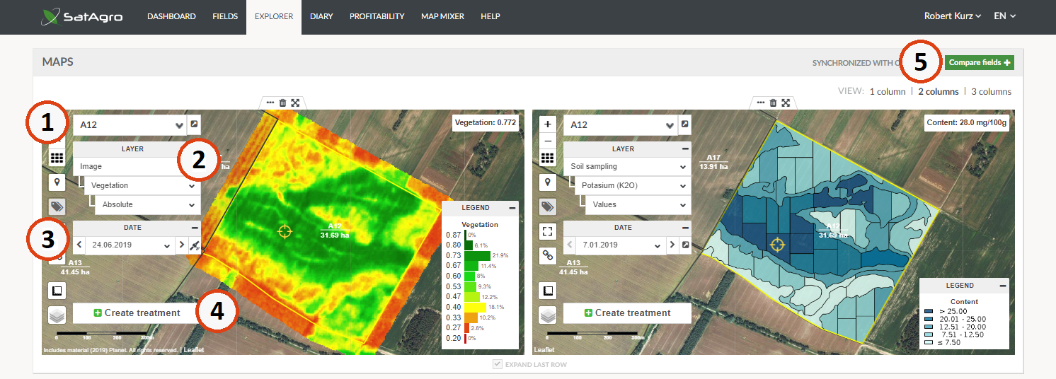
The Map area is where you can view spatial data, such as satellite imagery, variable rate application maps or yield maps. To choose what data should be displayed in the panel to the left of the map (field – (1), type of data – (2), dates – (3)). You can also switch between fields by clicking them in the map area.
If the data currently displayed in the map can be transformed by one of SatAgro’s tools, a button will appear in the bottom left (4).
A useful tool for analysis is the option of displaying multiple fields at the same time. You can either display all fields, or compare two side by side (5).
The Chart Area
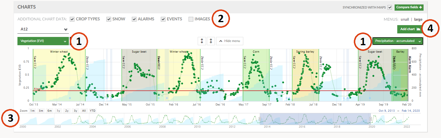
Time series can be displayed in the chart area, under the map.
You can choose the variables to be shown in the panels to the left and right (1). You can choose two in a single chart – this let’s you easily juxtapose multiple data sources. In the top left of the chart are tickboxes for additional data selection – image capture, alarms in the selected field, crop history (2).
To adjust the time interval visible on the chart, click and move the bar at the top or select one of the presets, e.g 1y – 1 year (3). To display more than two time series, click on the Add chart button (4).
 Platforma