09/28/2022
Crop scouting is the basis for the multitude of decisions which take into account variability in crop development across both space and time. In our case the Holy Grail are of course timely and user-friendly precision treatments, but in practice a large proportion of our users use crop scouting for other purposes, frequently surprising us with their ingenuity.
SatAgro Explorer was historically the first module of the SatAgro platform, which reflects our long-term believe that access to fresh and actionable satellite intelligence is the cornerstone of digital precision agriculture. Since 2015 the module has evolved a lot and this piece aims to highlight five key features which we consider very useful for crop scouting from the practice point of view.
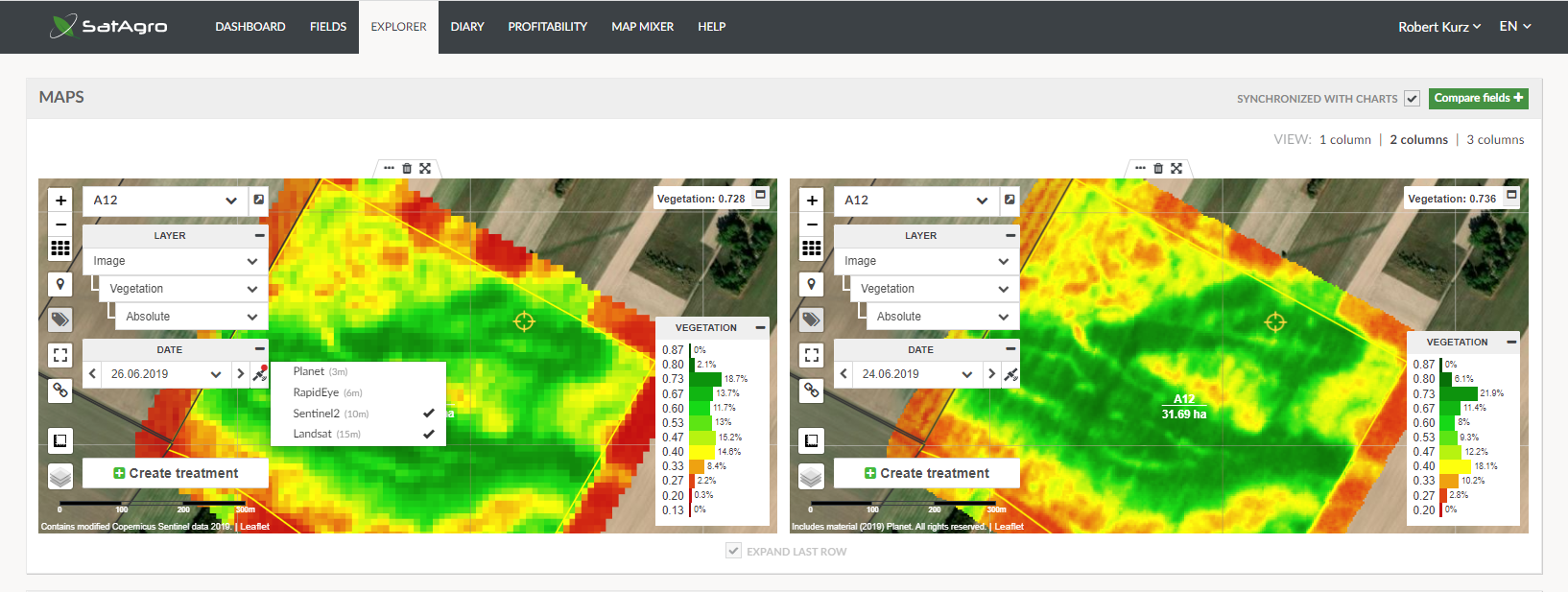
Tip 1. Access to imagery from Planet.
Since our beginning (2015) we offer a freely available Starter account which delivers publically available data to one crop field. This is our contribution to the popularisation of satellite-based precision and digital farming among farms, including small ones. It might not be obvious at the first sight, but as a partner of Planet, SatAgro also offers access to unique 3 m resolution images. Users who upgrade to the Premium plan, which includes data stream from Planet, tend to be excited not only by the enhanced spatial detail of vegetation maps, but also because the crop status is updated more frequently.
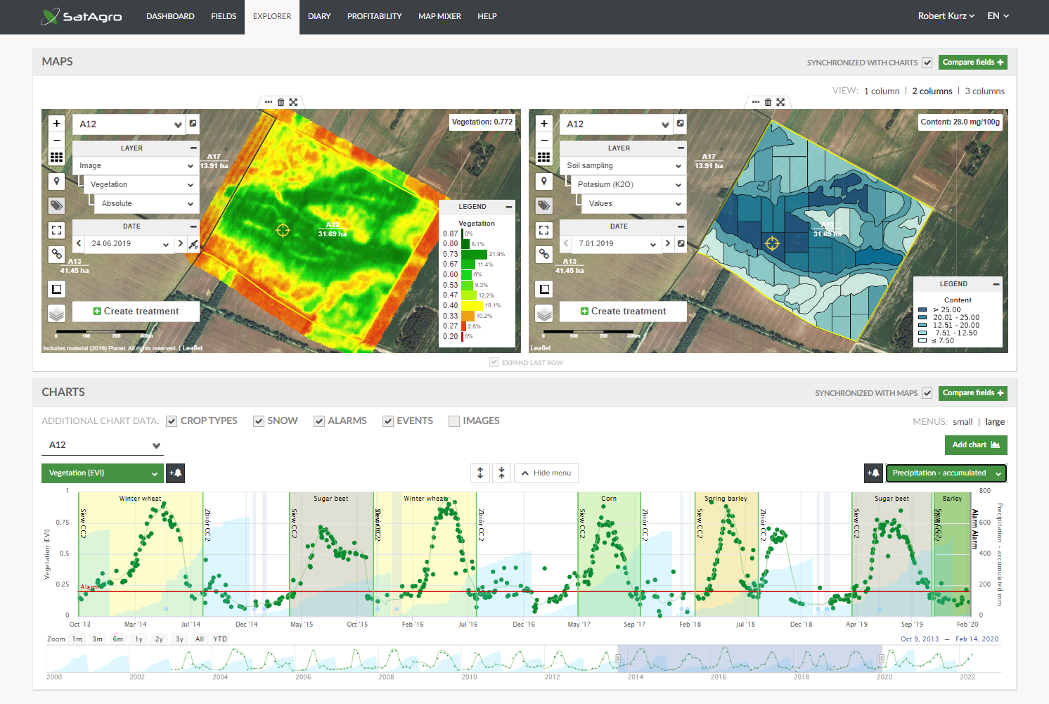
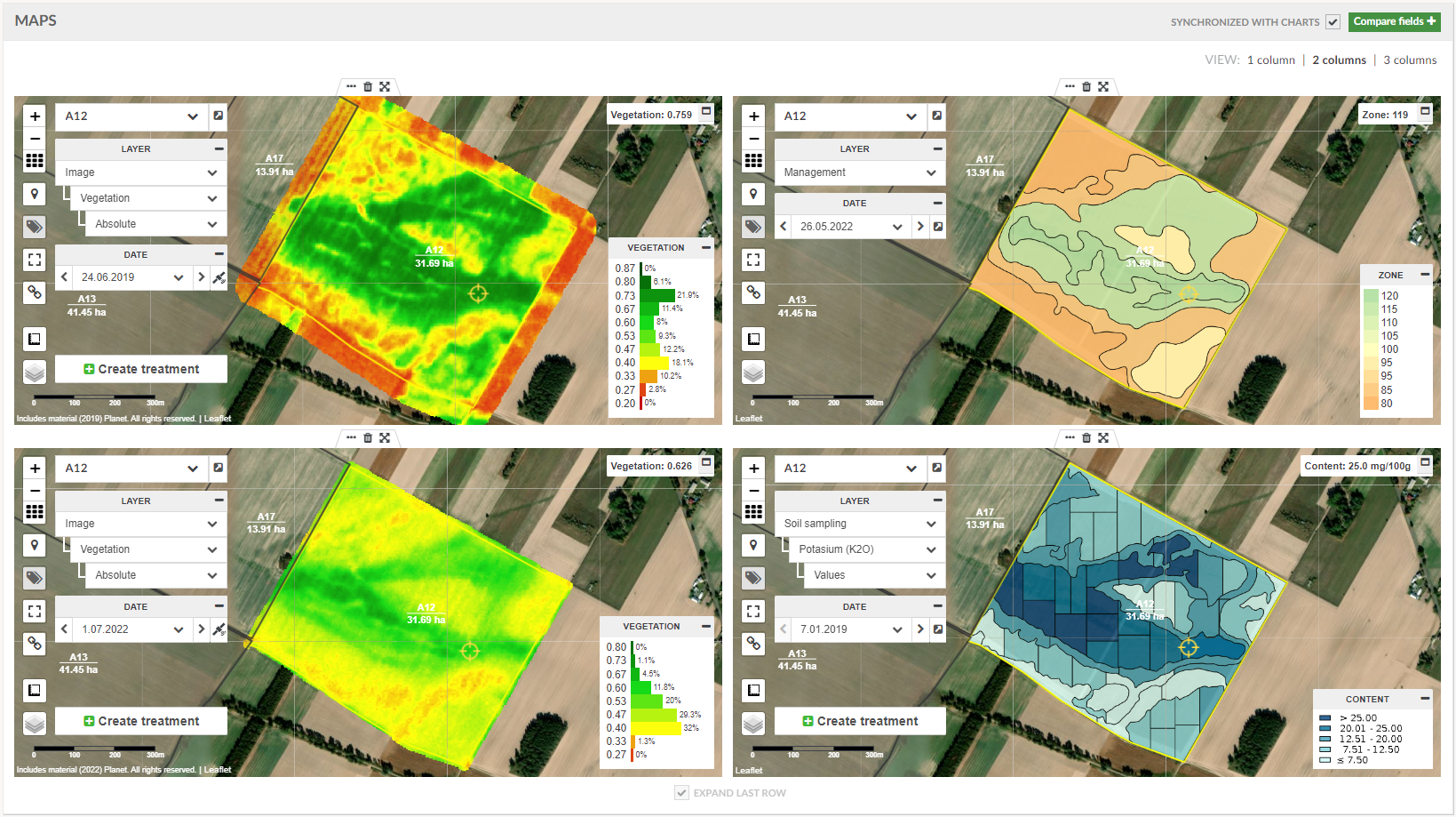
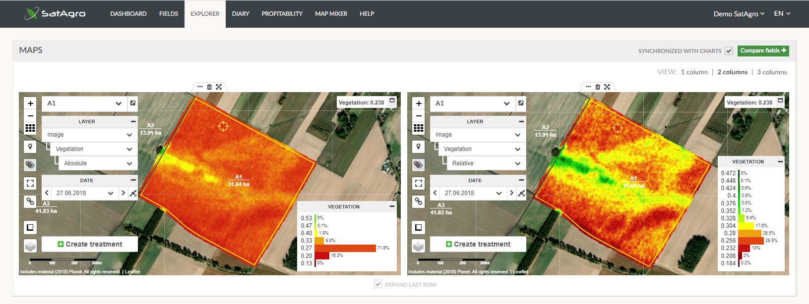
Tip 2. Multi-panel display.
When it comes to crop scouting, there is a real value in comparisons. Which field has the worst winter crop survival? Which part of the farm reached the highest production levels? What is the level of crop maturity in different crop fields? It might not be obvious at the first look, but in the SatAgro Explorer it is possible to open as many maps and graphs as one wishes, and to arrange them in various ways, so all required evidence for decision making is visible all at once. Only when your laptop sounds like it is about to fly away, you know that perhaps you went one window too far.
Another advantage of multi-window comparisons is that reading-in a point value , activated when one clicks on a map, is synchronised across all windows. This way it is possible to limit the measurement error linked to inadvertent picking of values from adjacent locations rather than exactly the same place.
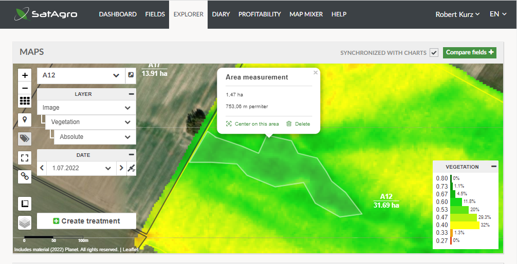
Tip 3. Area and distance measurement tool.
When an anomaly is spotted, to make the assessment more quantitative, an area, or a distance, can be measured. This can be useful, for example, when estimating unexpected losses, and the logistics of getting to them in a field, or to understand crop productivity better.
Tip 4. Static and dynamic colour scales.
The default “static” colour scale represents all of the possible range of values on a given map type. In the case of the vegetation index, the range is between 0 and 1. However, sometimes the values present in the map have a much smaller range, for example 0-0.3 in the spring, or 0.6-0.8 at the peak of the season. In this case there is not much colour variability. In such situations it might be better to switch to the “dynamic” colour scale. This will assign the actual range of values present in the image onto all colours in the colour scale. The approach might not be the best for comparisons between dates and fields (because each map will have a different relationship between values and colours) but it can certainly bring to life some new details, previously hidden to the eye.
Tip 5. Save and share your case.
Finally, once all the effort has been made to bring to life all the evidence needed for the decision, and it has been aligned in a perfect layout, the ultimate tip is to remember that this composition is encoded in the URL of the Explorer’s web page. The address can be copied and with it all the hard work can be saved, or shared with somebody who has access to the same SatAgro account. This will enable a swift re-creation of the layout . To give an example, in order to display the layout shown on SatAgro’s demo account, just click on the link below:
 Platforma